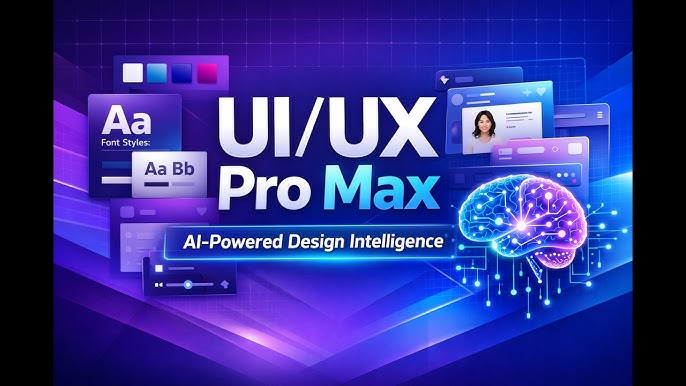
In my view, UI/UX Pro Max Skill is best understood as a design-intelligence toolkit for AI coding assistants rather than simply another collection of UI components. It is designed to help an AI agent make better decisions about interface structure, visual style, colors, typography, accessibility, responsive behavior, animation, and frontend implementation. The project describes itself as an AI-powered design intelligence system that works across multiple platforms and frameworks.
When I look at the problem it attempts to solve, the value becomes clearer. Generating a page with HTML, React, Next.js, Vue, or another framework is relatively straightforward. Producing an interface that feels coherent, accessible, responsive, and appropriate for its audience is much harder. UI/UX Pro Max Skill tries to give an AI coding agent structured design knowledge before it generates the interface.
Based on the available documentation, the skill combines searchable design information with a design-system generator. The current project documentation describes databases covering UI styles, color palettes, font pairings, product types, UX guidelines, icons, motion presets, charts, and multiple technology stacks.
I believe this distinction matters because an AI assistant can produce technically valid frontend code while still making poor design decisions. A page can compile successfully and remain visually confusing. It can also have attractive colors but poor contrast, oversized navigation, inadequate touch targets, inconsistent typography, or excessive animation.
Key Takeaways
The main lesson I take from UI/UX Pro Max Skill is that good frontend generation needs design reasoning before code generation. The skill encourages the AI to identify the product type, audience, visual direction, technology stack, and UX requirements before implementation.
The project currently supports a broad range of development environments, including React, Next.js, Vue, Nuxt, Svelte, Astro, SwiftUI, React Native, Flutter, Tailwind, shadcn/ui, Angular, Laravel, Three.js, and several desktop frameworks.
From my perspective, its most useful capabilities can be grouped into five areas:
- Design-system generation for establishing a coherent visual direction.
- Searchable design intelligence for styles, colors, typography, UX, icons, charts, and related decisions.
- Accessibility and usability guidance for avoiding common interface problems.
- Technology-specific recommendations for supported frontend stacks.
- Pre-delivery quality checks intended to catch common UI and UX problems before an interface is considered finished.
The important limitation is that I would not treat the skill as a replacement for user research, usability testing, or professional visual review. It provides structured recommendations, but recommendations still need to be evaluated against the actual product and audience.
What Is UI/UX Pro Max Skill?
UI/UX Pro Max Skill is an open-source AI skill created to provide design intelligence to AI-powered development environments. The project’s official repository identifies it as UI/UX Pro Max and describes it as a system containing design intelligence for UI/UX development across multiple platforms.
In practical terms, I would describe it as a layer between a developer’s product request and the AI assistant’s implementation process.
Without structured design guidance, a developer might ask an AI assistant:
“Build me a modern SaaS dashboard.”
The AI could generate a functional dashboard, but “modern” is ambiguous. Should it use a dark interface? A light interface? Bento cards? Dense tables? Large typography? Glass effects? What colors should represent success and errors? How should mobile navigation work?
UI/UX Pro Max Skill attempts to turn those vague decisions into a more systematic design process.
Its documentation recommends analyzing the product type, target audience, context, visual keywords, and technology stack before selecting a design direction.
That approach makes sense to me because interface quality depends heavily on context. A financial dashboard, children’s learning application, healthcare portal, luxury ecommerce store, developer tool, and social application should not automatically receive the same visual language.
How UI/UX Pro Max Skill Approaches Design Decisions
The skill’s workflow begins by analyzing the user’s requirements. The documentation specifically recommends identifying the product type, target audience and usage context, style keywords, and technology stack.
I consider that one of its most important principles.
Product Type Comes First
A design system should reflect what the product actually does.
For example, an analytics dashboard generally needs information density, strong hierarchy, readable charts, filtering controls, tables, and clear status indicators. A marketing landing page may instead prioritize visual storytelling, headlines, calls to action, testimonials, and product demonstrations.
A hypothetical example makes this easier to understand.
Imagine that I ask an AI assistant to design two websites:
- An accounting dashboard for business owners
- A photography portfolio for an independent photographer
Both could technically use the same framework and CSS utilities. However, I would not want them to have identical information architecture.
The accounting application needs efficient task completion. The portfolio needs visual presentation. Applying the same design pattern to both would therefore be inefficient.
Audience and Context Influence UX
The skill also encourages consideration of the audience and usage context.
A mobile application used outdoors has different readability requirements from a desktop application used in an office. A touch interface has different interaction requirements from a mouse-and-keyboard interface.
In my analysis, this is where UI and UX become inseparable. Visual decisions cannot be separated completely from how people interact with the product.
Style Keywords Help Establish Direction
Style keywords such as minimal, playful, vibrant, immersive, dark, or content-focused can influence the generated design direction.
The important point is consistency.
If I choose a minimalist visual language, I would expect spacing, typography, colors, components, and interaction effects to support that direction. I would not want one section to look minimalist while another suddenly resembles a glassmorphism dashboard without a strong reason.
Why the Design-System Generator Matters
The design-system generator is one of the central features highlighted by the project. The documentation explains that it analyzes project requirements and produces a tailored design system containing recommendations such as patterns, styles, colors, typography, effects, and anti-patterns.
I believe this is more valuable than simply asking an AI to “make the UI beautiful.”
Beauty is subjective, while a design system gives the AI constraints.
A useful design system can establish decisions such as:
- Primary and secondary colors
- Typography hierarchy
- Spacing scale
- Component styles
- Border treatments
- Interaction behavior
- Responsive principles
- Accessibility requirements
- Animation approach
- Visual patterns to avoid
Once these decisions are established, individual pages have a better chance of feeling like parts of the same product.
Why Consistency Matters
Let us consider a hypothetical SaaS application with five pages.
If the dashboard uses one button style, the settings page uses another, and the billing page uses a third, the application can feel unfinished even when each page looks acceptable individually.
A design system gives the AI a common source of direction.
The result should ideally be a system where:
Primary action → consistent button treatment
Secondary action → consistent secondary treatment
Page title → consistent typography
Form field → consistent spacing and states
Error → consistent semantic treatment
Navigation → consistent behavior
This consistency reduces cognitive load because users do not have to relearn interface patterns on every page.
Accessibility Should Be Treated as a Core Requirement
One of the strongest aspects of the documented UX rules is the emphasis on accessibility. The project’s quick-reference material places accessibility at the highest priority and highlights requirements such as sufficient contrast, alternative text, keyboard navigation, and appropriate ARIA labeling.
I believe accessibility should not be treated as an optional polish layer.
An interface may look excellent in a screenshot and still be difficult to use.
For example, consider a button represented only by an icon. A sighted mouse user may understand it immediately, but a screen-reader user may receive insufficient information if the control lacks an accessible label.
Similarly, low-contrast text can look stylish in a design mockup while becoming difficult to read for users with visual limitations.
The documented guidance highlights a minimum contrast target of 4.5:1 for relevant text and warns against removing focus indicators.
From my perspective, these rules are useful because they turn accessibility into something the AI can explicitly check rather than something developers remember only after implementation.
Touch Interaction and Mobile Usability
Touch interaction is another high-priority area in the documented guidelines. The skill recommends appropriately sized touch targets, adequate spacing, loading feedback, and avoiding interactions that depend exclusively on hover.
This is particularly important for mobile interfaces.
Imagine a navigation bar containing five tiny icons packed tightly together. On a desktop monitor, those controls may look acceptable. On a phone, they can become difficult to tap accurately.
A practical scenario would be a mobile banking application where the user needs to transfer money quickly. A small touch target can create unnecessary mistakes at exactly the point where accuracy matters most.
I therefore see touch-target guidance as more than a visual recommendation. It directly affects task completion.
Performance Is Part of UX
The skill’s documented priority system also includes performance-related UX recommendations, including modern image formats, lazy loading, reserving layout space, and reducing cumulative layout shift.
This is an important reminder that UX is not only about colors and typography.
A beautiful interface that shifts dramatically while loading can feel unreliable.
For example, suppose an article page initially renders text at the top and then pushes it downward when an image loads without reserved space. The user may click one element and suddenly find the page moving underneath them.
From my perspective, reserving space for dynamic content is a small implementation decision with a large usability benefit.
UI/UX Pro Max Skill Styles and Visual Design
The skill includes a searchable collection of interface styles. The exact catalog has evolved between versions, so I would avoid treating older numbers from third-party descriptions as permanently fixed. The current repository documentation describes a substantial collection of styles and other design resources.
The broader purpose is more important than any particular number.
The AI can search for an appropriate visual direction rather than selecting a random style.
Possible design directions can include approaches such as:
- Minimal interfaces
- Bento-style layouts
- Glass-inspired interfaces
- Editorial layouts
- Dashboard-oriented designs
- Bold typography
- Dark interfaces
- Playful interfaces
- Professional enterprise systems
The correct selection should depend on the product.
I believe the strongest use of these style recommendations is not blindly copying a visual trend. Instead, the style should establish a consistent visual vocabulary.
Choosing Colors With Purpose
Color selection is another major part of interface design.
A common mistake is to select colors simply because they look attractive. In a real application, colors also communicate meaning.
For example:
- Green may communicate success.
- Red may communicate destructive actions or errors.
- Yellow or amber may communicate warnings.
- Blue may function as a primary brand or interactive color.
However, color meaning can vary by context and culture, so I would not treat these associations as universal laws.
A stronger approach is to establish semantic color tokens.
Instead of scattering arbitrary hex values throughout components, a design system can define roles such as:
primary
secondary
success
warning
danger
background
surface
text
muted
This makes future design changes easier because the semantic role remains stable even when the underlying color changes.
Typography and Visual Hierarchy
Typography is one of the easiest ways to make an interface feel professional or amateur.
The skill includes font-pairing and typography recommendations, and its documentation emphasizes fundamentals such as readable body sizing and appropriate line height.
In my view, typography should primarily establish hierarchy.
A typical hierarchy might distinguish:
- Page titles
- Section headings
- Supporting headings
- Body text
- Labels
- Captions
- Metadata
The exact sizes depend on the product, but the relationship between them should be predictable.
Hypothetical Typography Example
Suppose a dashboard uses a 36-pixel heading, 16-pixel body text, 13-pixel labels, and 11-pixel secondary metadata.
That can work if the hierarchy remains readable.
However, if every card uses a different font size, weight, and line height, the dashboard can become visually noisy.
I believe consistency is usually more valuable than choosing the trendiest typeface.
Navigation and Information Architecture
Navigation is another area where design intelligence can help.
The documented UX guidance emphasizes predictable navigation, appropriate mobile navigation patterns, and avoiding overloaded navigation systems.
For example, mobile bottom navigation should not attempt to expose every possible destination.
If an application has fifteen major sections, placing fifteen icons into a bottom navigation bar is unlikely to create a good experience.
Instead, we can group related functions and use secondary navigation where appropriate.
The same principle applies to desktop sidebars. A long list of unrelated items can overwhelm users.
From my perspective, the best navigation answers one simple question:
Can the user predict where a particular action or destination will be found?
Practical Applications of UI/UX Pro Max Skill
I see several practical situations where the skill can be useful.
Building a New SaaS Application
For a SaaS application, the skill can help establish a coherent design system before individual dashboard components are generated.
A developer could specify the product type, target audience, desired visual character, and framework. The design-system process can then provide recommendations before implementation.
Creating a Landing Page
Landing pages benefit from strong visual hierarchy and conversion-oriented structure.
The skill includes landing-page patterns and can help an AI think about elements such as:
- Hero sections
- Calls to action
- Social proof
- Feature sections
- Testimonials
- Pricing
- FAQs
- Final calls to action
I would still validate the final structure against the actual marketing objective rather than assuming that one landing-page formula works for every business.
Designing Mobile Interfaces
Mobile applications require special attention to touch interaction, responsive layouts, safe areas, navigation, typography, and loading states.
The skill’s cross-platform focus makes it relevant to mobile development as well as web development.
Improving an Existing Interface
The skill does not need to be limited to greenfield projects.
It can also be useful when an existing interface feels inconsistent.
For example, a developer might discover that:
- Buttons use inconsistent spacing.
- Cards have different border radii.
- Typography varies unnecessarily.
- Mobile layouts break at certain widths.
- Focus states are missing.
- Icons are inconsistent.
- Animations are too slow.
These are precisely the types of issues that structured UX rules can help identify.
Comparing UI/UX Pro Max Skill With an Ordinary AI UI Prompt
The following comparison shows why I consider structured design intelligence different from a generic request to an AI assistant.
| Approach | Typical Process | Main Strength | Main Limitation |
|---|---|---|---|
| Generic UI prompt | Ask AI to create a page | Fast initial generation | Design decisions may be inconsistent |
| Existing component library | Assemble predefined components | Consistency and speed | May not solve product-specific UX decisions |
| Manual design system | Designer establishes rules | Strong control | Requires more planning and expertise |
| UI/UX Pro Max Skill | AI analyzes product and design requirements | Structured AI-assisted design decisions | Recommendations still require human validation |
| Human design + AI implementation | Designer establishes direction, AI assists coding | Strong combination of design judgment and implementation speed | Requires coordination and review |
The key takeaway is that UI/UX Pro Max Skill is not necessarily a replacement for designers. I see it more as a way of giving AI coding tools better design constraints.
Step-by-Step Approach to Using UI/UX Pro Max Skill
The documented workflow provides a useful general sequence for using the skill.
Step 1: Identify the Product
I would first define exactly what I am building.
For example:
“A project-management SaaS application for small remote teams.”
That is more useful than simply saying:
“Make a modern dashboard.”
Step 2: Define the Audience
Next, specify who will use the interface and where.
For example:
“Users are small business teams who primarily use desktop browsers during working hours, with occasional mobile access.”
That immediately provides more UX context.
Step 3: Define the Visual Direction
I would then specify visual preferences.
For example:
“Professional, clean, approachable, content-focused, light interface, subtle motion.”
Step 4: Identify the Technology Stack
The documentation specifically recommends detecting or identifying the technology stack rather than silently assuming one. Supported environments include numerous web and mobile technologies.
This matters because implementation guidance should reflect the framework.
Step 5: Generate the Design System
The skill’s documentation recommends starting new projects with the design-system generation workflow. It can produce recommendations covering patterns, visual style, colors, typography, effects, and anti-patterns.
Step 6: Supplement With Targeted Searches
If the initial design system does not answer a specific question, the documentation describes additional searches for domains such as UX, typography, colors, icons, charts, landing pages, and animation.
This is useful because not every project needs the same level of detail in every category.
Step 7: Validate the Implementation
The final step should be human review.
I would check:
- Does the interface make sense?
- Can users complete primary tasks?
- Is the contrast adequate?
- Does keyboard navigation work?
- Are touch targets usable?
- Does the layout work on mobile?
- Does the design remain consistent?
- Are animations helpful?
- Does the interface actually fit the target audience?
A generated design should never be considered finished simply because the code runs.
Common Mistakes When Using AI for UI Design
AI-generated interfaces can still contain serious design problems.
Mistake 1: Asking for “Modern” Without Context
The word modern has little precision.
One developer might mean minimalism. Another might mean glass effects. Someone else might mean large typography and editorial layouts.
A better prompt describes the desired characteristics and audience.
Mistake 2: Mixing Unrelated Styles
A page can become visually confusing when multiple design trends are combined without a reason.
For example, excessive glass effects, brutalist typography, neumorphic controls, and corporate dashboard components may each work individually but create an incoherent system when mixed randomly.
Mistake 3: Ignoring Accessibility
An interface should not be judged solely by its screenshot.
Missing focus indicators, inadequate contrast, poor labels, and inaccessible interactions can undermine an otherwise attractive design. The skill explicitly prioritizes accessibility concerns.
Mistake 4: Overusing Animation
Animation can make interfaces feel responsive, but too much motion can become distracting.
The documented guidance recommends restrained animation durations and emphasizes that motion should communicate meaning rather than exist merely as decoration.
Mistake 5: Treating Trends as UX Principles
A design trend is not automatically a usability improvement.
I believe this is one of the most important distinctions for AI-generated design.
A fashionable interface can still have poor information architecture.
Animation, Motion, and Interaction Feedback
The skill also contains guidance related to animation and motion. Its documentation recommends using motion to communicate meaning and continuity rather than adding decorative movement everywhere.
A useful example is a modal dialog.
If the modal appears instantly, the transition may feel abrupt. A short entrance animation can establish spatial continuity.
By contrast, animating every card whenever the user scrolls can quickly become distracting.
I generally think motion should answer a question:
Does this animation help the user understand what just happened?
If the answer is no, the animation deserves reconsideration.
Forms, Errors, and Feedback
Forms are another area where UX quality can make a significant difference.
The documented rules recommend visible labels, errors near the relevant field, helper text, and progressive disclosure.
Consider a registration form with five fields.
If the user submits invalid information and the application displays only “Something went wrong” at the top of the page, the user has to search for the problem.
A better experience identifies the affected field and explains what needs to change.
For example:
Password: Must contain at least the required character types.
That is actionable feedback.
I believe this principle applies beyond forms. Whenever a user action produces a state change, the interface should communicate the result clearly.
Charts and Data Visualization
For dashboards, charts can create additional UX challenges.
The skill includes recommendations for chart selection and data visualization, including concerns such as legends, tooltips, and accessible color usage.
Color should not be the only method of communicating information.
Suppose a chart distinguishes three categories solely through three colors. A user who cannot distinguish those colors may lose important information.
Labels, patterns, symbols, positioning, or tooltips can provide additional context.
Choosing a Chart
| Data Question | Potential Visualization | Why It Can Work |
|---|---|---|
| How does a metric change over time? | Line chart | Shows trends |
| How do categories compare? | Bar chart | Makes magnitude comparisons clear |
| What percentage does each category represent? | Stacked or proportional chart | Shows composition |
| What are individual records? | Table | Preserves exact values |
| Where are values concentrated? | Heatmap | Shows distribution across two dimensions |
| What is the relationship between two variables? | Scatter plot | Shows correlation patterns |
The important lesson is that the chart should answer the user’s question rather than simply decorate the dashboard.
Design-System Persistence and Reuse
The documentation also describes a persistence mechanism for design systems. A master design system can be stored in a project and supplemented with page-specific overrides.
I find this concept particularly useful for larger applications.
Imagine an application with:
- Marketing website
- Dashboard
- Billing
- Settings
- Admin panel
- Mobile application
A master system can establish global principles while page-specific rules handle legitimate differences.
This is better than regenerating every page from scratch because the AI has a persistent design reference.
Second Comparison: Design Decisions and Their Risks
This table focuses on practical decisions rather than implementation technologies.
| Design Area | Strong Practice | Common Risk | Practical Check |
|---|---|---|---|
| Color | Use semantic color roles | Random colors across components | Check consistency and contrast |
| Typography | Establish clear hierarchy | Too many sizes and weights | Scan headings and body text |
| Navigation | Keep destinations predictable | Overloaded menus | Test common tasks |
| Touch | Use sufficiently large targets | Tiny controls | Test on an actual device |
| Animation | Communicate state and continuity | Decorative motion everywhere | Test reduced-motion behavior |
| Forms | Visible labels and local errors | Placeholder-only labels | Complete the form as a new user |
| Charts | Match visualization to question | Decorative or misleading charts | Ask what decision the chart supports |
| Accessibility | Keyboard, labels, contrast | Treating accessibility as optional | Perform an accessibility review |
The most important takeaway is that the skill provides guidance, but the final quality still depends on validation.
What I Would Use UI/UX Pro Max Skill For
From my perspective, the strongest use cases are situations where an AI coding assistant needs more structure around frontend design.
I would consider it especially useful for:
- New SaaS products
- Admin dashboards
- Marketing websites
- Mobile application interfaces
- Ecommerce experiences
- Internal business tools
- Design-system creation
- UI redesigns
- Responsive frontend work
- Accessibility-focused reviews
I would be more cautious about treating it as sufficient for products where extensive user research, regulatory review, or specialized human-computer interaction expertise is required.
What UI/UX Pro Max Skill Cannot Replace
The project can provide structured design intelligence, but I would not confuse that with real-world validation.
It cannot automatically know:
- What users actually prefer
- Which business metric matters most
- Whether a workflow is genuinely efficient
- Whether a particular brand direction fits a market
- Whether users understand unfamiliar terminology
- Whether an accessibility implementation works perfectly for every assistive technology
- Whether a product’s information architecture reflects actual customer behavior
Those questions require observation, testing, research, and judgment.
This is why I see AI design skills as force multipliers rather than autonomous designers.
A Verified Perspective on Human-Centered Design
A useful quotation for this discussion comes from Don Norman, whose work strongly influenced modern human-centered design. His emphasis is relevant because interface quality ultimately concerns people rather than visual decoration.
“Design is really an act of communication.”
Don Norman, The Design of Everyday Things.
This principle matters here because UI/UX Pro Max Skill is most useful when its recommendations are interpreted as communication decisions. A button communicates an available action. A warning communicates risk. Typography communicates hierarchy. Navigation communicates structure.
The visual system is therefore part of the product’s language.
Why Structured AI Design Can Improve Frontend Development
I believe the biggest opportunity is not that AI can generate prettier interfaces. The bigger opportunity is that AI can become more systematic about why an interface should look and behave a particular way.
Instead of:
“Make this page look professional.”
we can provide:
“Design a desktop-first project-management dashboard for small remote teams. Prioritize task completion, clear hierarchy, accessible contrast, compact but readable data density, predictable navigation, and restrained motion. Use a consistent design system and responsive behavior.”
That second instruction gives the AI far more useful constraints.
The skill’s design-system workflow is built around this kind of structured reasoning.
A Practical Workflow I Recommend
If I were using UI/UX Pro Max Skill for a new project, my process would be straightforward.
First, I would define the product and audience.
Second, I would identify the platform and technology stack.
Third, I would establish the visual direction.
Fourth, I would generate the design system.
Fifth, I would review the resulting recommendations rather than accepting them blindly.
Sixth, I would implement the highest-priority screens.
Seventh, I would test the interface at desktop and mobile sizes.
Finally, I would review accessibility, interaction states, typography, navigation, performance, and consistency.
This approach gives the AI room to accelerate implementation without allowing it to make every design decision without oversight.
Verified Quote on Human-Centered Design
Another relevant perspective comes from Steve Krug, whose usability writing emphasizes simplicity and ease of use.
“Don’t make me think.”
Steve Krug, Don’t Make Me Think, Revisited.
I consider this especially relevant to AI-generated interfaces. A visually sophisticated page can still fail if users must spend unnecessary effort figuring out how it works.
The strongest UI/UX systems therefore balance visual quality with clarity.
Is UI/UX Pro Max Skill Worth Using?
In my view, it can be worthwhile for developers who regularly use AI coding assistants to build interfaces.
The project is open source under the MIT license, and its repository provides installation information and supported platforms.
Its greatest advantage is structure.
Instead of relying entirely on an AI model’s generic visual instincts, the skill gives the model access to organized design rules and searchable recommendations.
However, I would not describe it as a magic solution.
If the product requirements are vague, the generated design can still be inappropriate. If the user experience is fundamentally flawed, attractive styling will not fix it.
The strongest result comes from combining the skill with clear requirements and human review.
Conclusion
I believe UI/UX Pro Max Skill is most valuable as a structured design companion for AI-assisted frontend development. Its documented approach combines design-system generation, searchable UI knowledge, UX guidelines, accessibility considerations, visual recommendations, and framework-specific guidance.
From my perspective, its biggest advantage is not simply the number of styles, palettes, fonts, or rules available. The real benefit is encouraging the AI to think about product context before producing interface code.
We can reasonably conclude that good AI-generated UI requires more than functional code. It needs hierarchy, accessibility, consistency, responsive behavior, appropriate interaction patterns, and a design direction that matches the product.
My practical recommendation is to begin with a clearly defined product, audience, platform, and visual goal. Then use the generated design system as a starting point rather than an unquestionable final answer. Review the implementation on real screen sizes, test important workflows, and validate accessibility before launch.
For developers building interfaces with AI, I believe that combination of structured design intelligence plus human judgment is where the greatest value lies.
Frequently Asked Questions
What is UI/UX Pro Max Skill?
UI/UX Pro Max Skill is an AI design-intelligence toolkit intended to help coding assistants make better UI and UX decisions. It provides searchable information covering design styles, colors, typography, UX guidelines, icons, charts, product patterns, and supported technology stacks. The project also includes a design-system generation workflow that analyzes project requirements and produces tailored recommendations.
Is UI/UX Pro Max Skill free?
Yes. The project’s repository identifies the software as open source under the MIT license. However, using it with an AI coding assistant can still involve costs associated with that separate AI service.
Which AI coding tools support UI/UX Pro Max Skill?
The current documentation lists numerous supported environments, including Claude Code, Cursor, Windsurf, GitHub Copilot, Codex, Gemini CLI, Qoder, Roo Code, Continue, and others. The exact supported list can change as the project evolves, so I recommend checking the current project documentation before installation.
Does UI/UX Pro Max Skill generate complete websites?
It is primarily a design-intelligence skill rather than a standalone website builder. It provides recommendations and structured design information that an AI coding assistant can use while designing or implementing interfaces. The resulting website or application is still produced through the development environment and technology stack being used.
Can UI/UX Pro Max Skill work with React and Next.js?
Yes. React and Next.js are among the supported technology stacks described in the project’s documentation. The workflow is intended to provide stack-aware recommendations rather than forcing every project into one implementation approach.
Does UI/UX Pro Max Skill replace a UI/UX designer?
No. In my view, it is better treated as an AI-assisted design resource. It can help establish design direction and identify common UX considerations, but it cannot replace user research, usability testing, product strategy, or expert human judgment.
Can it help with accessibility?
Yes. Accessibility is explicitly treated as a high-priority UX category in the documented rules, including considerations such as contrast, alternative text, keyboard navigation, and accessible labeling.
Should I accept every recommendation it produces?
No. I recommend treating the output as a design starting point. A recommendation can be technically reasonable while still being inappropriate for a particular audience or product. Human review remains important, especially for accessibility, business requirements, information architecture, and usability.
Sources and References
- Official UI/UX Pro Max Skill repository and project metadata.
- Official skill documentation describing its workflow, design-system generation, UX rules, supported stacks, and search domains.
- Official project introduction describing the design-intelligence toolkit and design-system generator.
- UI/UX Pro Max quick-reference documentation covering application areas and UX principles.
Disclaimer
This article is provided for general informational and educational purposes. UI/UX Pro Max Skill and its underlying resources can change as the project is updated. I have relied on publicly available project documentation and have not represented any personal testing, professional experience, or independent product evaluation as fact. Readers should review the current official project documentation and independently validate design, accessibility, security, performance, and implementation decisions before using the skill in a production application.